
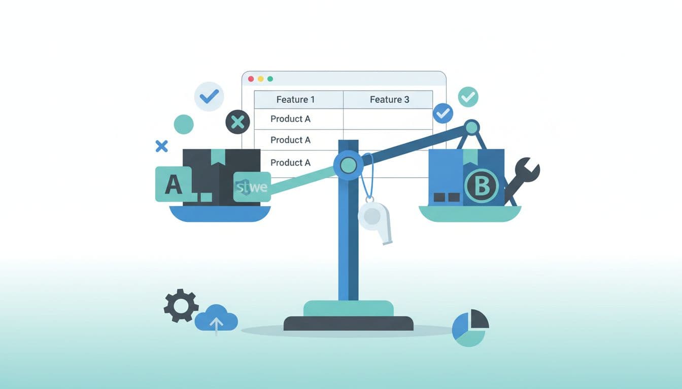
Someone searching “A vs B” isn’t browsing. They’re picking. Your job is to act like the calm referee who hands them the whistle, the scorecard, and the final call.
That’s why affiliate comparison keywords are so valuable. They attract readers who are close to buying, but they also attract tough competition and picky visitors. If your page feels slow, vague, or salesy, they’ll bounce in seconds.
This post breaks down a practical A vs B affiliate post formula that wins both ways: it satisfies intent fast (so you can rank), and it makes the decision easy (so you can convert).
Why A vs B searches rank well (and why they bounce fast)
Comparison searches are “decision queries.” The reader usually has two tabs open, a card in hand, and about zero patience for a 2,000-word life story. They want an answer, then evidence.
Most A vs B SERPs reward pages that do three things well:
- Call the match early: a quick verdict that shows you understand the trade-off.
- Back it up: clear criteria, proof, and real use cases.
- Make it safe: trust signals like testing notes, transparent pros and cons, and a clear disclosure.
A simple mental model: an A vs B page is not a review, it’s a shortcut. Think of it like asking a friend, “Which one should I buy?” They’ll answer first, then explain.
Also, not all “A vs B” searches mean the same thing. Some readers want features, some want price, and some want a recommendation for their situation. That’s why a page should support multiple micro-intents.
Here’s a clean way to cover them without bloating the article:
| What the reader wants | What they’re thinking | What to show fast |
|---|---|---|
| Quick decision | “Just tell me.” | 2–3 sentence verdict |
| Key differences | “What’s actually different?” | table + top 3 differences |
| Fit for their use case | “Which one fits me?” | “Choose A if…” section |
| Confidence | “Will I regret this?” | testing notes + cons |
Google’s own guidance is user-first: make content easy to understand and useful, not a maze of affiliate buttons. Keep that principle in view (and it tends to align with rankings too). A good reference is Google’s SEO Starter Guide.
The A vs B affiliate post formula (with copy-paste templates)

The highest-converting comparison pages feel like a good product picker: quick upfront help, then detail for the cautious buyer. Use this order.
1) Headline that matches the decision
Use a format that sets expectations, not hype.
Headline formulas:
- A vs B: Which is better for (use case)?
- A vs B for beginners: What to pick in 2026
- A vs B: Key differences, pricing, and best fit
2) Intro script that earns the next scroll
Keep it tight, then give the verdict.
Intro script (edit the brackets):
- “If you’re choosing between A and B, you’re likely stuck on [1–2 pain points].”
- “Here’s the quick answer: Choose A if [reason]. Choose B if [reason].”
- “Below is a side-by-side table, then real-world notes from testing.”
3) Quick verdict box (above the fold)
Don’t hide the answer like it’s a season finale.
Verdict template:
- Best for most people: A (because [primary reason]).
- Best for [specific use case]: B (because [primary reason]).
- Deal-breaker to watch: [one limitation].
4) Comparison table that makes scanning easy
Your table should answer the “what’s different?” question in under 20 seconds.
Recommended table fields:
- Pricing model (monthly vs yearly vs one-time)
- Learning curve (beginner-friendly vs technical)
- Core features (3–6 items, not everything)
- Support and community
- Integrations or compatibility
- Best for (use cases)
- Biggest downside (yes, include it)
Example structure:
| Criteria | Product A | Product B | Notes |
|---|---|---|---|
| Best for | [use case] | [use case] | One line |
| Ease of use | [simple] | [moderate] | Mention setup time |
| Standout feature | [feature] | [feature] | What it changes |
| Support | [type] | [type] | Response times if known |
| Downside | [con] | [con] | Be honest |
5) Pros and cons blocks that sound human
Avoid fluffy pros like “great value.” Tie each point to a buyer outcome.
Pros and cons template:
- What you’ll like: [benefit + who it helps].
- What may annoy you: [cost, limitation, learning curve].
- Who should skip it: [specific reader profile].
6) CTAs that don’t feel like a shove
Your CTA should match the reader’s stage (ready now vs still deciding).
CTA copy examples:
- “Check current pricing for A (good fit if you want [benefit]).”
- “Try B if you care most about [benefit], it’s the cleaner choice for that.”
- “Still unsure? Start with A, it’s easier to set up, then switch later if you outgrow it.”
Trust and compliance (don’t skip this)
A comparison post is a trust exercise. Treat it like one.
Do:
- Disclose affiliate relationships near the top, in plain language.
- Mention how you tested or evaluated (even if it’s structured research).
- Update dates when pricing or features change.
Don’t:
- Promise earnings or results you can’t prove.
- Hide affiliate links behind vague buttons.
- Claim “best” without explaining “best for who.”
How to rank for affiliate comparison keywords in 2026 (without sounding spammy)

To win affiliate comparison keywords, you need more than a table. You need the kind of page that deserves to be the final tab someone closes after they buy.
Match the SERP shape
Before writing, scan the top results and note what Google is rewarding:
- Are the top pages short with a strong verdict, or long and detailed?
- Are they using tables, “best for” callouts, and FAQ sections?
- Do they show first-hand experience (photos, testing notes, constraints)?
You’re not copying, you’re matching expectations. Then you beat them with clarity.
Build proof without turning it into a lab report
“Testing notes” is one of the easiest upgrades for conversions and trust.
Testing notes ideas (choose what’s real for you):
- Setup time (timed, with date)
- What you tried (features used, integrations tested)
- Support experience (ticket, chat, response time)
- Who it worked best for (new user vs advanced)
If you use affiliate links, do it cleanly. Google has long discouraged sneaky linking practices, and readers hate them too. A helpful overview of link handling and best practices is this affiliate links and SEO guide.
On-page details that move the needle
Small choices often decide rankings in tight SERPs:
- Put the verdict and table high on the page (but not the only content).
- Add use-case sections (A for X, B for Y) so readers self-select fast.
- Keep comparison criteria consistent across sections (don’t change the “rules” mid-game).
- Improve internal consistency: if you say A is “easier,” explain why and for whom.
Create a simple update routine
Comparison posts rot faster than evergreen tutorials because prices and features change. Treat updates like oil changes, not home renovations.
A practical cadence:
- Quick check monthly (pricing, core features, availability)
- Deeper refresh quarterly (screenshots, testing notes, new alternatives)
If you want a broader view of how SEO fits into affiliate growth, this overview on combining SEO with affiliate marketing is a solid refresher.
Conclusion
A vs B pages win when they act like a good friend with a clipboard: clear verdict first, then evidence, then a gentle next step.
Keep the structure tight, be honest about trade-offs, and make updates part of the plan. Do that, and affiliate comparison keywords stop feeling like a lottery and start acting like a system.
Which two products are you comparing next, and what’s the single decision point your reader cares about most?
My Name Is Rafael Ferreras. I share practical tips, tools, and resources to help make building income online simpler and more approachable. I am a professional digital marketer with over 14 years of experience in the industry. My expertise is in email marketing and boosting conversions with bridge pages. I write about affiliate marketing and traffic generation.

